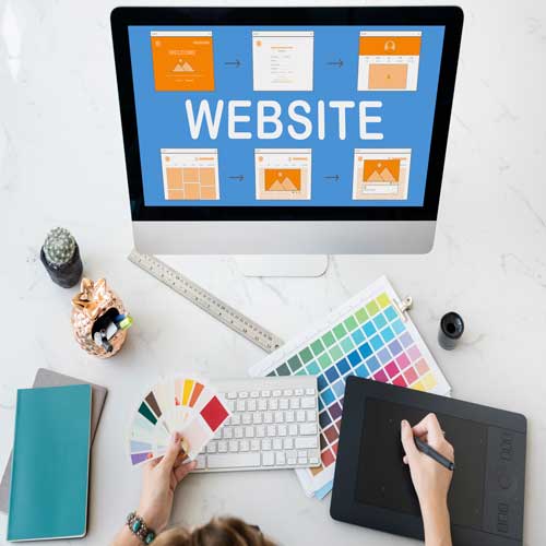
An effective website design should serve its purpose by conveying its specific message and engaging the visitor. A good web design incorporates several elements: consistency, colors, typography, imagery, simplicity, and functionality.
A well-designed website can help build trust and guide visitors to action. Creating a great user experience entails ensuring that your website design is optimized for usability (form and aesthetics) and how simple it is to use (functionality).
9 PRINCIPLES OF GOOD WEB DESIGN
PURPOSE OF THE WEBSITE
Your website must meet the needs of the user. On all pages, having a simple, clear intention will help the user interact with what you have to offer. What is your website’s purpose? After that, Are you providing practical information, such as a “How to” guide? Is it a website for entertainment, such as sports coverage, or are you selling a product to the user? Websites can serve many different purposes, but some are common to all of them.
- Expertise Description
- Developing Your Reputation
- Creating Leads, Selling, and Following Up
EASINESS
When it comes to your website’s user experience and usability, simplicity is the best way to go. The following are some design strategies for achieving simplicity.
Colour
Color can convey messages and elicit emotional responses. Finding a color palette that works for your brand will allow you to influence your customers’ behavior. Keep the color palette to no more than five hues. Colors that complement each other work exceptionally well. Color combinations pleasing to the eye increase customer engagement and make the user feel good.
Type
Typography plays a vital role in your website. It draws attention and serves as a visual representation of the brand’s voice. Likewise, Typefaces should be legible, and the website should only use a maximum of three different fonts.
Imagery
Still, photography, illustration, video, and all forms of graphics are included. All imagery should be expressive, capture the spirit of the company, and serve as an embodiment of the brand’s personality. That is to say, The majority of the information we consume on websites is visual. As a first impression, it is critical to use high-quality images to create an impression of professionalism and credibility in the minds of visitors.
NAVIGATION
The website navigation system allows visitors to interact and find what they are looking for. The ability to navigate a website is critical to retaining visitors. to clarify, Visitors will abandon your website if the navigation is difficult to understand. Keeping navigation simple, intuitive, and consistent across all pages is critical.
READING OF AN F-SHAPED PATTERN
The F-based pattern is the most common way for website visitors to scan text. According to eye-tracking studies, most of what people see is in the top and left areas of the screen. subsequently, The F-shaped layout mimics our natural reading pattern in the West (left to right and top to bottom). A well-designed website will accommodate a reader’s natural scanning pattern.
HIERARCHY OF VISUALS
The arrangement of elements in order of importance is known as a visual hierarchy. This is accomplished through size, color, imagery, contrast, typography, whitespace, texture, and style. Meanwhile, Establishing a focal point, which shows visitors where the most critical information is, is one of the essential functions of visual hierarchy.
CONTENT
A good website has both good design and good content. on the other hand, Great content can attract and influence visitors by converting them into customers using persuasive language.
LAYOUT BASED ON GRID
Grids help to structure your design and organize your content—the grid assists in aligning and keeping elements on the page clean. Above all, The grid-based layout arranges content into a clean rigid grid structure with columns and sections that line up, feel balanced and impose order, resulting in a visually appealing website.
TIME TO LOAD
Visitors will leave if they have to wait for a website to load. Nearly half of web visitors expect a site to load in two seconds or less, and they may abandon a place that does not load within three seconds. In other words, Image optimization will help your site load faster.
PHONE FRIENDLY
More people are browsing the web on their phones or other mobile devices. It is critical to consider building your website with a responsive layout that can adjust to different screen sizes.
Our team will bring your website to life and tell your story. We are a ‘family’ of creative practitioners in design, marketing, and technology. Get in touch to learn more.


